

What machine learning tells you about the person doing it
Thesis: Nothing new under the sun, it's all just fashion, new words, more modern tools for what we always did.


Antithesis: It's the Singularity!


This created a virtuous cycle
- AlexNet (2012), a first sign of AI spring, very successful image classification deep NN
→ More research
→ More deployed apps, speech recognition, image recognition, machine translation, self-driving cars, robots,
→ More data, more investment in hardware and algos
→ Huge advances in many applications
→ Huge growth in investment in research, better hardware, perpetuating the cycle
→ General AI and beyond? (Or a new AI winter?)
An Evolutionary Process
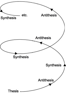
Synthesis -


Small quantitative changes add up, and eventually reach a tipping point where you see a large qualitative change, like water turning to ice.
“It is said that there are no sudden changes in nature, and the common view has it that when we speak of a growth or a destruction, we always imagine a gradual growth or disappearance. Yet we have seen cases in which the alteration of existence involves not only a transition from one proportion to another, but also a transition, by a sudden leap, into a … qualitatively different thing; an interruption of a gradual process, differing qualitatively from the preceding, the former state”
G. W. F. Hegel (1770-1831)
German philosopher, first to write about the hype cycle and the tipping point
What is Machine Learning?
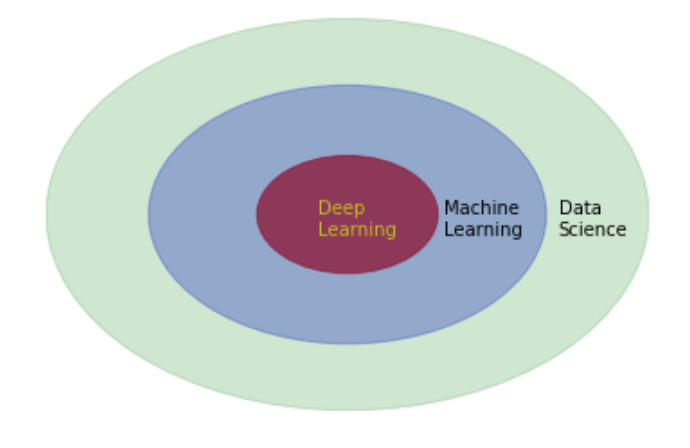
Deep learning
- Many machine learning algos (neural net layers) trained end to end on a complex task
- Human like performance in a hard or uncertain domain: computer vision, natural language, games, self-driving cars
- Often outperforms humans, but (for now) in a narrow domain, stable, non-adversarial context

Machine Learning


import plotly
from plotly.offline import download_plotlyjs, init_notebook_mode, plot, iplot
from plotly.graph_objs import *
from plotly.figure_factory import create_table
init_notebook_mode(connected=True)
import numpy as np
import pandas as pd
import scipy
import statsmodels
import statsmodels.api as sm
from statsmodels.formula.api import ols
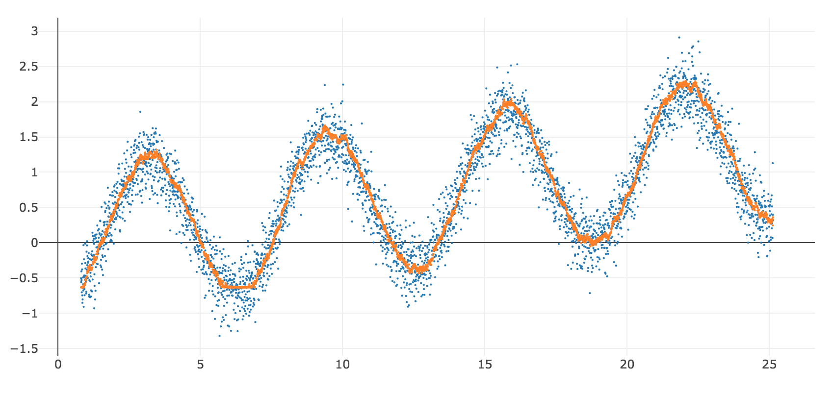
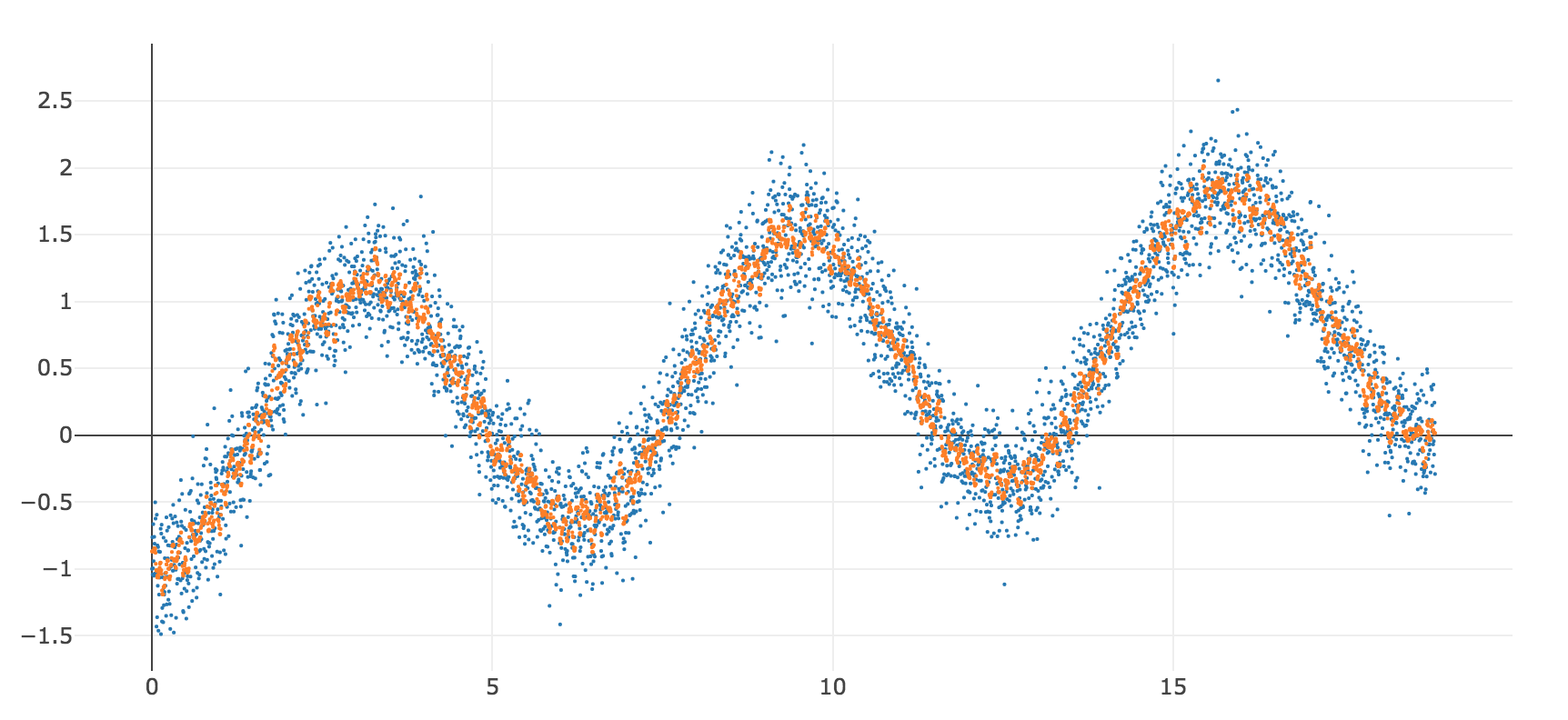
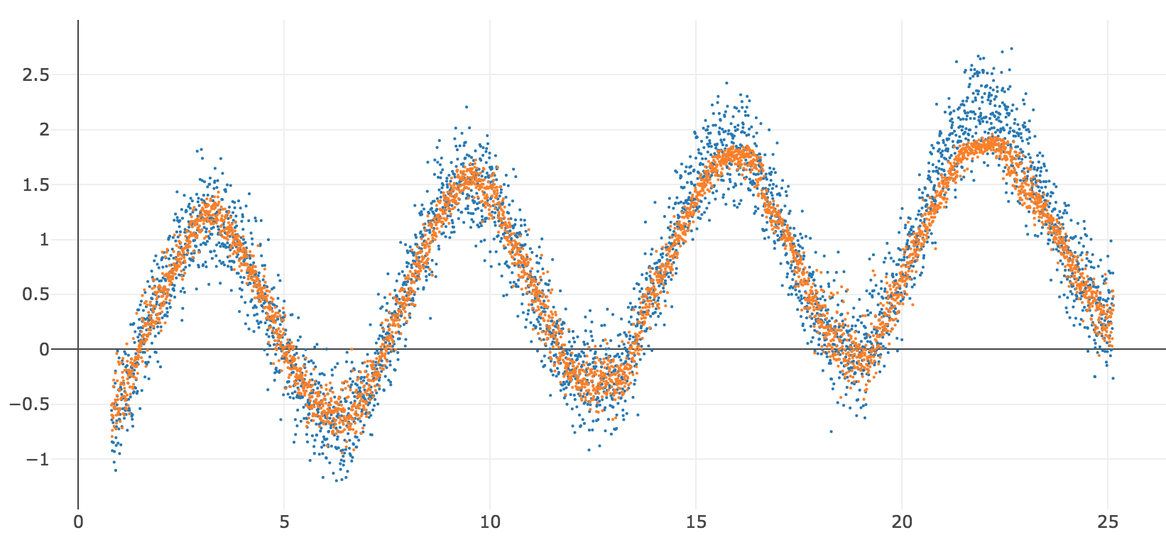
# create a data set, sin wave plus random noise
nobs = 4000
x = np.linspace(0, 6*np.pi, num=nobs)
y = -np.cos(x) + x*0.05 + np.random.normal(0, 0.25, nobs)
z = np.sin(x) + x*0.05 + np.random.normal(0, 0.25, nobs)
df = pd.DataFrame({'x' : x,'y': y,'z': z})
# chart it
def mychart(*args):
# pass some 2d n x 1 arrays, x, y, z
# 1st array is independent vars
# reshape to 1 dimensional array
x = args[0].reshape(-1)
# following are dependent vars plotted on y axis
data = []
for i in range(1, len(args)):
data.append(Scatter(x=x,
y=args[i].reshape(-1),
mode = 'markers',
marker = dict(size = 2)
))
layout = Layout(
autosize=False,
width=800,
height=600,
yaxis=dict(
autorange=True))
fig = Figure(data=data, layout=layout)
return iplot(fig) # , image='png' to save notebook w/static image
mychart(x,y)
#table = create_table(df)
#iplot(table, filename='mydata')

# Very Important
### These are  *in-sample* statistics on the training data
### Hence the disclaimer

formula = 'y ~ x'
model = ols(formula, df).fit()
ypred = model.predict(df)
model.summary()
mychart(x,y,np.array(ypred))
For traditional statistical inference, you want
- A valid, complete a priori linear model
- Normally distributed errors
Things go awry if your data does not match assumptions of OLS
- If your model is not correctly specified, your regression line may not be as predictive as it should be.
- If you don't have normally distributed errors, your p-values and inference about future distributions are wrong because your errors are not random.
- (Even if future is like the past (stationarity))


You need to know what you are doing.
- Visualize your raw data and errors
- Sanity-check your model
- Use appropriate tests to avoid violations of assumptions of OLS:
- Nonlinearity
- Heteroskedascisity
- Autocorrelation
- Multicollinearity
- Other non-normality of errors
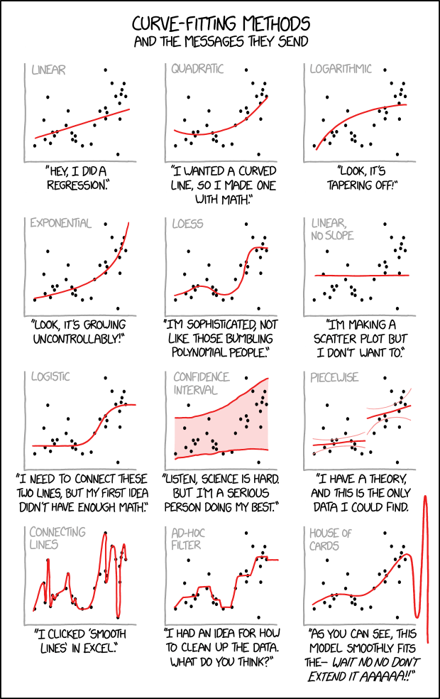
If you don't have a good linear model, you need to find a better model, transform the data, add variables. If your data violates the assumptions of OLS, you need to understand why and fix it. You can't just throw data at statistical models without knowing what you're doing.
"With four parameters you can fit an elephant to a curve, with five you can make him wiggle his trunk" - John von Neumann

# visualizing how everything is an outlier when you add dimensoions
# curse of dimensionality

import matplotlib.pyplot as plt

# set up the figure
fig = plt.figure()
ax = fig.add_subplot(111)
ax.set_xlim(0,11)
ax.set_ylim(0,11)

# draw lines
xmin = 0
xmax = 10
y = 5
height = 1

plt.hlines(y, xmin, xmax)
plt.hlines(y, 2.5, 7.5, color='r')

plt.vlines(xmin, y - height / 2., y + height / 2.)
plt.vlines(xmax, y - height / 2., y + height / 2.)
plt.vlines(2.5, y - height / 2., y + height / 2., color='r')
plt.vlines(7.5, y - height / 2., y + height / 2., color='r')

# add numbers
plt.text(xmin - 0.1, y, '0', horizontalalignment='right')
plt.text(xmax + 0.1, y, '100', horizontalalignment='left')
plt.axis('off')
plt.show()

fig = plt.figure()
ax = fig.add_subplot(111, aspect='equal')
plt.axis('on')
#plt.axes().set_aspect('equal', 'datalim')

offset = np.sqrt(50)/2

ax.set_xlim(0,10)
ax.set_ylim(0,10)

# (or if you have an existing figure)
# fig = plt.gcf()
# ax = fig.gca()

square1 = plt.Rectangle((0, 0), width=10, height=10, color='g', alpha=0.2)
square2 = plt.Rectangle((5-offset, 5-offset), width=offset*2, height=offset*2, color='blue', alpha=0.3)

ax.add_artist(square1)
ax.add_artist(square2)


plt.show()


sz = 0.5 ** (1/3)
start = (1-sz)/2
end = start + sz
print(start)
print(end)
data = [
    Mesh3d(
        x = [start, start, end, end, start, start, end, end],
        y = [start, end, end, start, start, end, end, start],
        z = [start, start, start, start, end, end, end, end],
        colorscale = [[0, 'rgb(255, 0, 255)'],
                    [0.5, 'rgb(0, 255, 0)'],
                      [1, 'rgb(0, 0, 255)']],
        intensity = [0, 0.142857142857143, 0.285714285714286,
                     0.428571428571429, 0.571428571428571,
                     0.714285714285714, 0.857142857142857, 1],
        i = [7, 0, 0, 0, 4, 4, 6, 6, 4, 0, 3, 2],
        j = [3, 4, 1, 2, 5, 6, 5, 2, 0, 1, 6, 3],
        k = [0, 7, 2, 3, 6, 7, 1, 1, 5, 5, 7, 6],
        name='y',
        showscale=True
    )
]
layout = Layout(
    xaxis=plotly.graph_objs.layout.XAxis(
        title='x',
    ),
    yaxis=plotly.graph_objs.layout.YAxis(
        title='y',
        range=[0, 1]
    )
)
fig = Figure(data=data, layout=layout)
iplot(fig, filename='3d-mesh-cube-python')
- When you increase the number of dimensions, most of the data are outliers
- Even if you increase the amount of data! Doesn't help
- Looked at another way, if 10% of your data on a dimension is an outlier:
- after 7 dimensions, most of your data is an outlier on some dimension (1-0.9^7)
x1 = [n for n in range(1,50)]
y1 = [(0.9 ** n) for n in range(1,50)]
pd.DataFrame({'x' : x1, 'y' : y1})
mychart(np.array(x1), np.array(y1))
- Suppose you want nonlinearity, 3 inflection points in each direction, 3 predictors, all interactions
- Number of predictors rises exponentially as you increase degree of nonlinearity (I want to say C(deg+n, deg) but doesn't look right, left as an exercise)
- Data you need to maintain significance as you increase number of predictors is (I think) exponential on that number
Machine Learning: how you predict when you are no longer constrained by
Data size - think about how you would predict if you had unlimited data
Computational complexity - think about how you would predict if you had unbounded computation capacity
Turns out you can often predict a bit better than OLS
Train
- Draw a training sample
- Train a machine learning models on training set (as many as you want)
- Try different algorithms
- Try different degree of complexity
- Different degrees of nonlinearity
- Different degrees of smoothing/regularization (will discuss further)
Cross-validate
- Draw a cross-validation set
- Take your trained models, use them to predict in cross-validation
- Choose the model that performs best in cross-validation
- Now, the act of picking a model contaminates the cross-validation set. Your best model is probably pretty good, but it's also probably one that was a little more lucky in cross-validation.
Evaluate
- Draw a test set
- Evaluate the performance of the model in the test set. Since it is effectively out-of-sample data, it's a reasonable estimate of performance to expect in out-of-sample data.
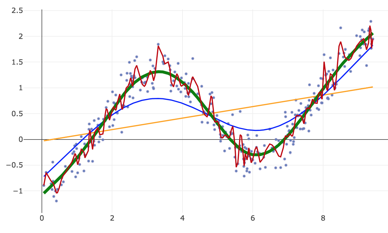
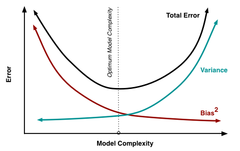
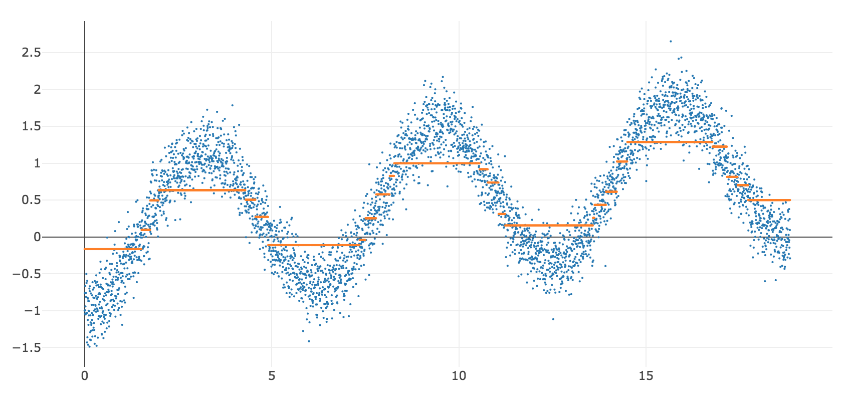
- High bias: more linear, doesn't chase outliers
- High variance: more kinky, more susceptible to noise
- You need to set your squelch so it kills the noise but lets the music through
- Run regressions in browser with different models : https://cs.stanford.edu/people/karpathy/convnetjs/demo/regression.html
The most important chart in machine learning
2. The ROC curve 
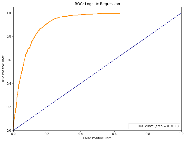
3. The firewall principle: Never make any decision to modify your model using the test set, and never use the training or cross-validation data sets to evaluate its out-of-sample performance.
Regularization is very important in tuning your model and finding the right bias/variance tradeoff
- An example is L2 regularization in regression
- Instead of minimizing your mean-squared-error, minimize MSE + the sum of the squares of all your model coefficients
- This will tend to shrink your coefficients (and also equalize them). If a coefficient is large, it might be because it's very significant, or it might be because it's an outlier.
- Regularization increases bias, when you use the correct amount of it, you get worse fit in-sample, but better fit out-of-sample, because you are not chasing outliers. It makes your model more robust.
With decision trees, you might use fewer or shallower trees, with ensemble models, you might use fewer models. The point is to make your model simpler, chase fewer outliers, be more robust, generalize better out-of-sample.
The 2 key things in machine learning are
- Always pick model that performs best in xval (adjusted for complexity if possible)
- Worse is better: A lot of innovation in finding ways to make models resistant to outliers (more biased=worse) without impacting out-of-sample performance
Machine Learning paradigm vs Statistics
| Statistics | Machine learning |
|---|---|
| Small data | Big data (need a lot of data for complex models - exponential with #variables/kinks) |
| Optimize model in-sample error | Optimize cross-validation error |
| Assume linear (or some a priori functional form) | Algorithm finds model |
| Choose predictors and functional form (usually parsimonious and linear) | Algorithm chooses from many predictors and models (greedy and nonlinear while being robust) |
| Optimize as much as possible | Worse is usually better |
| Can't overfit a parsimonious model with limited data | Use regularization to tune and find optimal balance between bias and variance |
| Inference: description, prediction, attribution | Focus on prediction - attribution often opaque |
| You need to know what you are doing | You need to know what you are doing |
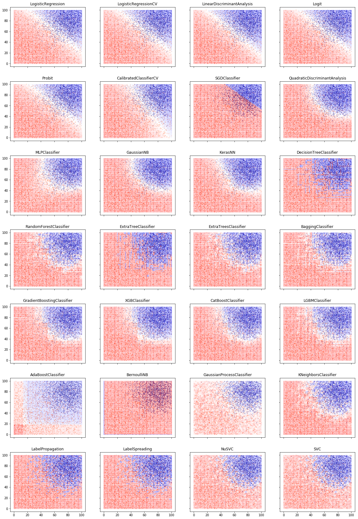
Neural Network Model
Random Forest Model (Decision tree ensemble)
Recurrent Neural Network (GRU)
Boost models are very popular but this one didn't work too well
Random forest : ensemble of parallel decision trees that are trained in parallel on subsets of the predictors and vote
Boosted decision trees: ensemble of decision trees that are trained sequentially with increasing weight on incorrectly predicted observations
Possibly XGBoost is mostly used for classification or possibly needs further tuning
- People talk about machine learning and complex models they go, ooh, you're data mining, overfitting: In fact, very focused on being robust, not chasing outliers, avoiding overfitting
- You can overfit with linear models when you run many models on small samples and just publish the ones that work.
- Power poses - Amy Cuddy
- Brian Wansink
- These practices were widespread, unfortunate academics were penalized not because they were worse, but because they were popular media darlings.
- With adequate data and good methodology you avoid overfitting
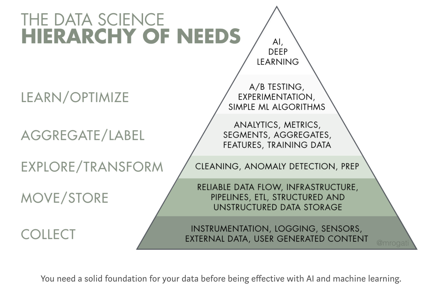
ML sometimes needs big data but what do we mean by big data?
Computational perspective
- Big data is data that doesn't fit in a box: a single computer's memory
- Google - canonical example
- Query gets multiplexed to dozens (100s?) of servers in a cluster, which each contain a shard of the index
- Results, including excerpts (!) get collected and sorted by relevance
- SERP gets built and returned in a fraction of a second
- By employing PageRank and at-the-time novel cluster architecture which caches the entire Internet and its full-text index, Google achieved a quantum leap in web scale Internet services
- Google - canonical example
Big data is where you need to use clusters
You've come a long way, baby: current biggest AWS instance

Big Data = scale-out stack
These days big data has to be REALLY REALLY BIG before you need a Google cluster/Hadoop cluster approach.
Sometimes it might make sense to use the big data scale-out cluster approach as opposed to scale-up huge instances.
Big data can refer to this type of stack, even if the data is not big data in a Google / Facebook web-scale sense or in a computational sense.
Data science perspective
Big Data:
- Sufficient data that you aren't constrained in terms of model complexity
- Sufficient data that p-values are irrelevant because you can make them arbitrarily small by increasing sample size.
See also https://datascience.berkeley.edu/what-is-big-data/ - A lot of definitions boiling down to, size of data that was unreasonable in the PC era but tractable in cloud environment. Big enough for machine learning. A lot of people say big data when they mean machine learning, modern predictive analytics.
Big data = enough data that you don't worry about having enough data for complex models, don't worry about p-values
Supervised Learning
You have labeled data: a sample of ground truth with features and labels. You estimate a model that predicts the labels using the features. Alternative terminology: predictor variables and target variables. You predict the values of the target using the predictors.
Regression. The target variable is numeric.
- Example: you want to predict the crop yield based on remote sensing data.
- Algorithms: linear regression, polynomial regression, generalized linear models.
Classification. The target variable is discrete or categorical.
- Example: you want to detect the crop type that was planted using remote sensing data. Or Silicon Valley’s “Not Hot Dog” application.
- Algorithms: Naïve Bayes, logistic regression, discriminant analysis, decision trees, random forests, support vector machines, neural networks of many variations: feed-forward NNs, convolutional NNs, recurrent NNs.
Unsupervised learning
You have a sample with unlabeled information. No single variable is the specific target of prediction. You want to learn interesting features of the data:
- Clustering. Which of these things are similar?
- Example: group consumers into relevant psychographics.
- Algorithms – k-means, hierarchical clustering.
Anomaly detection. Which of these things are different?
- Example: credit card fraud detection.
- Algorithms: k-nearest-neighbor.
Dimensionality reduction. How can you summarize the data in a high-dimensional data set using a lower-dimensional dataset which captures as much of the useful information as possible (possibly for further modeling with supervised or unsupervised algorithms)?
- Example: image compression, de-noising
- Algorithms: principal component analysis (PCA), neural network autoencoders, denoising autoencoders.
Representation: take a large body of text or movies or songs and create dense vectors describing them.
- Example: Recommendation engines, natural language processing (NLP)
- Algorithms: Word2vec, GlOVe
Reinforcement learning
You might think unlabeled/labeled pretty much covers all the bases.
Reinforcement learning can be viewed as 'meta' supervised learning.
You are presented with a game or real-world task that responds sequentially or continuously to your inputs, and you learn to optimize behavior in the form of a policy function to maximize an objective through trial and error.
- The algorithm goes out and explore the problem space and create its own high-level representation of the problem.
- Then it creates a policy to solve the problem
- Create a Markov decision matrix that maps the environment to actions - policy function.
- Label the matrix with the outcomes that followed.
- Then it optimize the matrix by gradient descent.
RL resembles supervised learning but at a higher level.
- 'Imperfect' map from action to outcome
- You get a big negative reinforcement when you screw up, run a stop sign, run over a pedestrian.
- You get a positive reinforcement when you navigate to your destination safely.
- From those high level labels, you have to model the game by finding high-level abstractions to describe situations you encounter, map them to actions using a policy function, and optimize the policy function based on the outcomes.
It's sufficiently important that nowadays people put it in its own category. (Also this is how you might implement a trading robot).
More amazing examples of machine learning -
Vision
- Image classification
- Style transfer
- Google Quick, Draw!
- Generating photorealistic images from (essentially) descriptions
- Generating faces using GANs
Audio
Natural language
Reinforcement learning
Other great stuff
Problems
Narrowness and brittleness of deep learning is an Achilles heel - doesn't work well yet in unstable, hostile environments
- Wave a stop sign at a self-driving car and it will stop. Small problems like snow very partly obscuring a stop sign may make it blow through the stop sign. May not work in NY because people will just walk in front of cars. For most deep learning applications you still need a controlled environment. Hopefully we won't get disasters, pushback and decades of AI winter.
- You need a LOT of data for complex models
Learning resources
This deck is based on a couple of blog posts I did
- https://alphaarchitect.com/2017/09/27/machine-learning-investors-primer/
- https://alphaarchitect.com/2018/06/05/machine-learning-financial-market-prediction-time-series-prediction-sklearn-keras/
- AAblogpost.pdf in this repo
Get the Anaconda distribution and dive in via a course or tutorials
Python resources
Online books
- http://www.diveintopython.net/
- http://learnpythonthehardway.org/
- http://code.google.com/edu/languages/google-python-class/introduction.html
Tutorials
Other good reads
- http://mirnazim.org/writings/python-ecosystem-introduction/
- http://wordaligned.org/articles/essential-python-reading-list#tocpython-tutorial
- http://jessenoller.com/good-to-great-python-reads/
- https://bitbucket.org/gregmalcolm/python_koans/wiki/Home
Practice
- https://codewars.com - solve simple problems in browser, run test cases, then see how other people solved it, often in a better way
MOOCs
- https://www.datacamp.com/courses/intro-to-python-for-data-science
- https://www.coursera.org/learn/machine-learning
- https://see.stanford.edu/Course/CS229
- https://www.coursera.org/learn/neural-networks
- https://lagunita.stanford.edu/courses/HumanitiesandScience/StatLearning/Winter2015/about (probably too easy for you)
- https://www.coursera.org/learn/probabilistic-graphical-models
- https://www.coursetalk.com/
- https://www.class-central.com/
Frameworks
Textbooks
- https://www.amazon.com/Deep-Learning-Python-Francois-Chollet/dp/1617294438/
- https://www.amazon.com/Hands-Machine-Learning-Scikit-Learn-TensorFlow/dp/1491962291/
- https://www.amazon.com/Deep-Learning-Adaptive-Computation-Machine/dp/0262035618/ (theory textbook)
- https://web.stanford.edu/~hastie/Papers/ESLII.pdf
- https://www.amazon.com/Advances-Financial-Machine-Learning-Marcos/dp/1119482089
Blogs/roadmaps
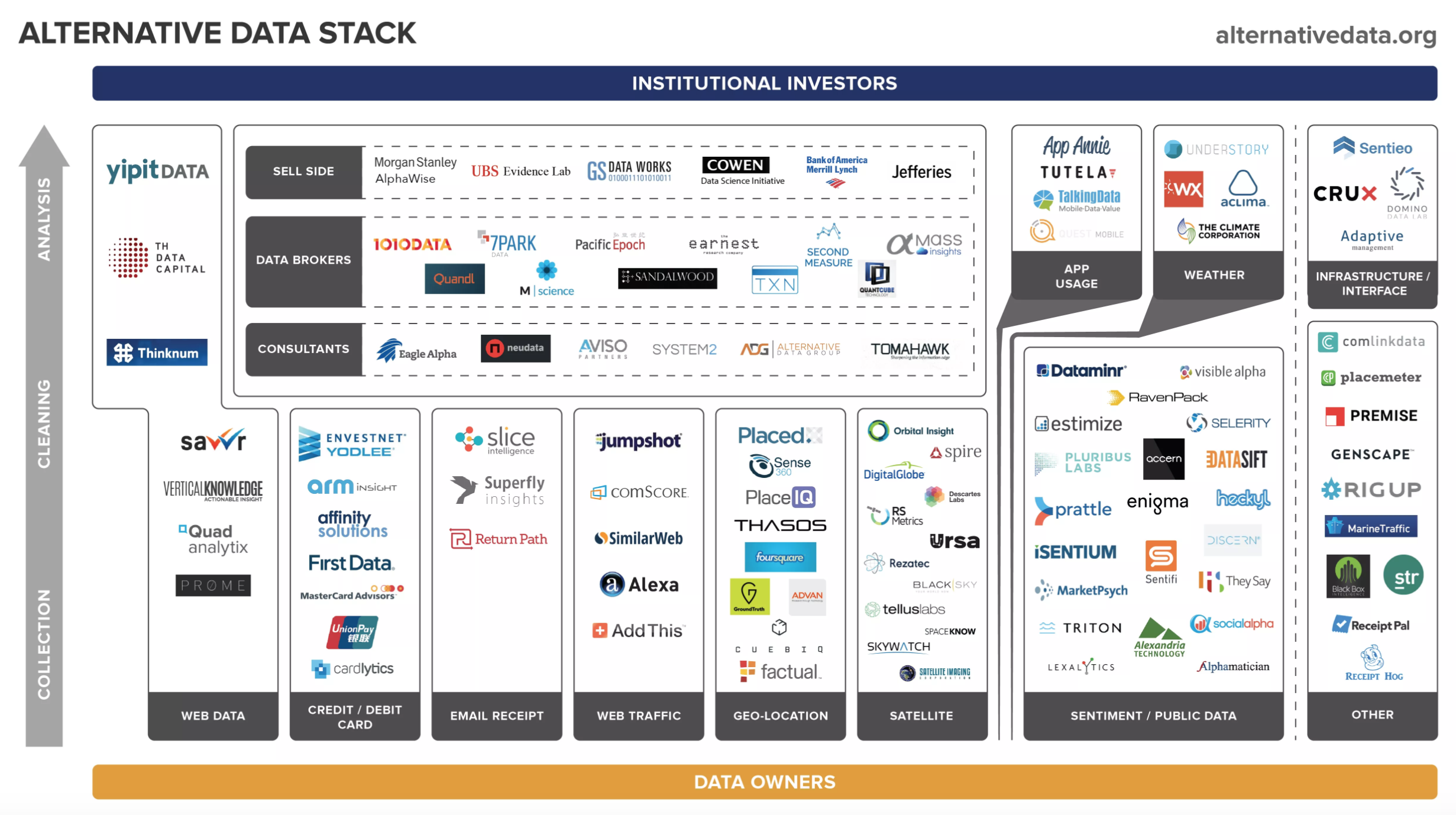
Alternative Data
- Everyone is selling your data ...
- Cell phone location data widely avaiable
- Free apps mine what you are buying
- Checkins, expense trackers, loyalty cards? just a way for our HF overlords to get richer
- It's 80%/20% data engineering / data science - this stuff is very resource-intensive
- Data is expensive - $40m was a data budget I heard for big quant HFs like WorldQuant, DE Shaw, Two Sigma, RenTech
- If you think you have a great idea, Jim Simons probably already got there 10 years ago - jk but real edges fleeting, exclusive data / quant edge hard to find/ephemeral/rapidly evolving
- Bifurcation between the real quants like RenTech, Two Sigma which are basically tech firms, and fundamentalists, the latter will probably mostly use alt data research / data from 3rd parties, maybe have a couple of data scientist types internally for projects
- Might be transformative, if all economic activity is instrumented and feeds directly into economic nowcasts / AI-driven markets
- Might be worst of 1984/Brave New World, everyone carrying a telescreen in their pocket which is as addictive as soma.
Alternative Data Landscape - http://alternativedata.org
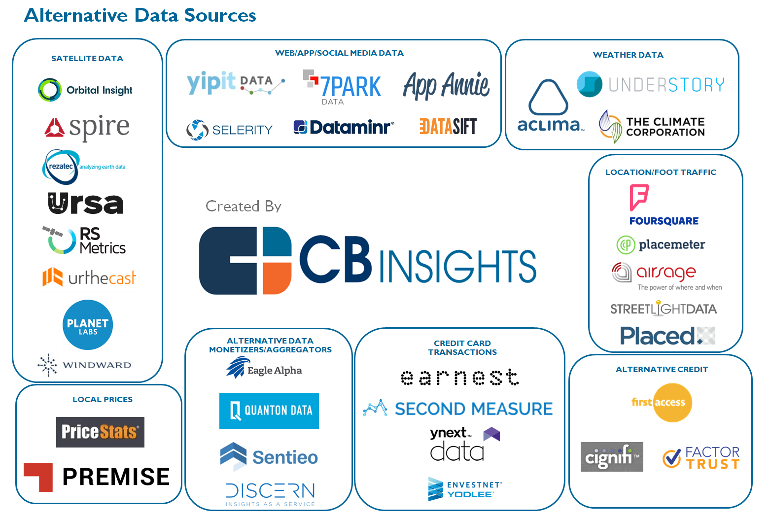
Alternative Data Landscape - CB Insights
http://mattturck.com/the-new-gold-rush-wall-street-wants-your-data/
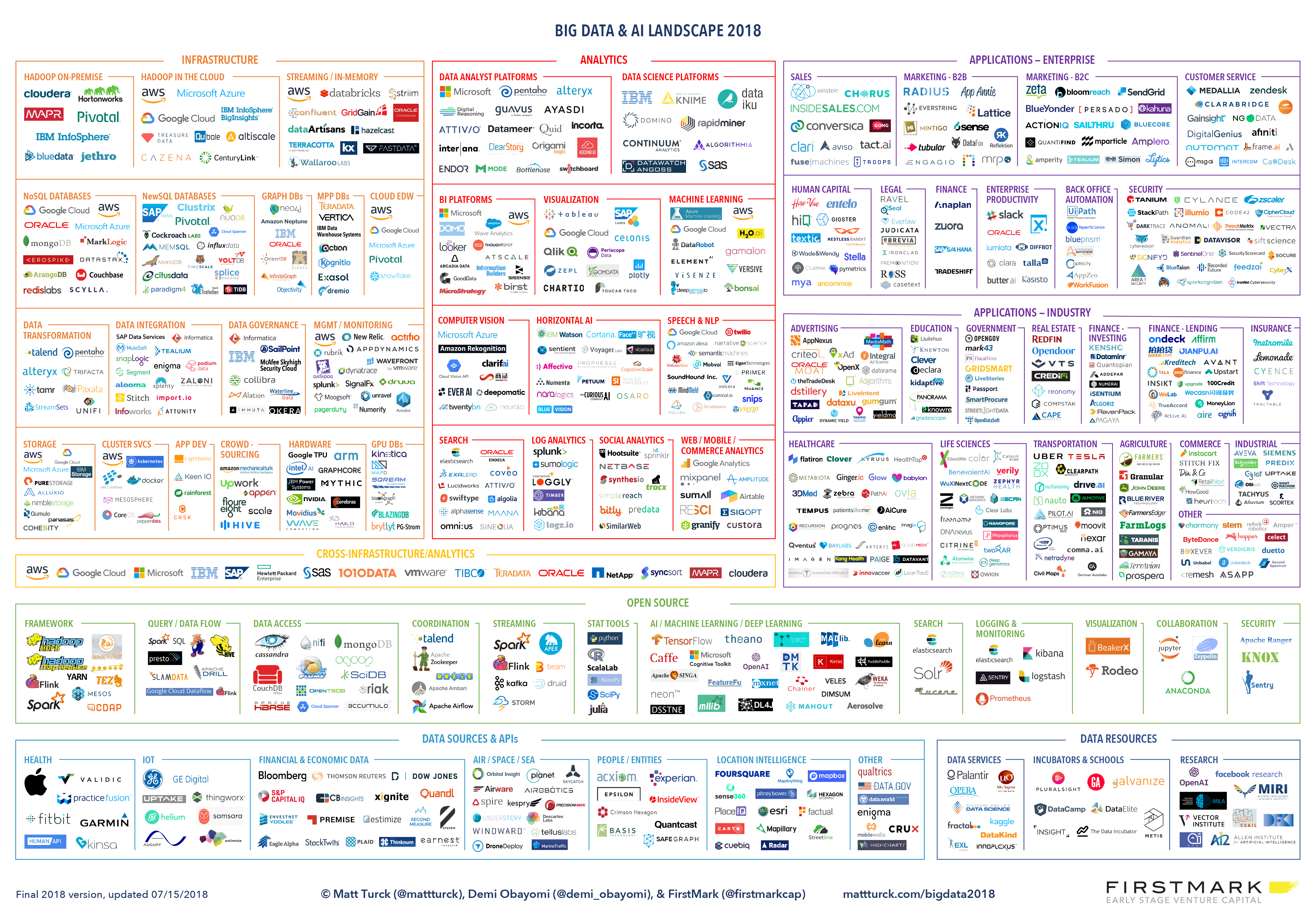
Big Data Landscape
Matt Turck - http://mattturck.com/wp-content/uploads/2018/07/Matt_Turck_FirstMark_Big_Data_Landscape_2018_Final.png
Jupyter Notebook https://github.com/druce/HFTC2018Q3/blob/master/HFTC.ipynb
git clone https://github.com/druce/HFTC2018Q3 ( Jupyter notebook or HFTC.slides.html )
Follow @streeteye on Twitter